Innesco
As a graphic designer at Innesco, a dynamic organisation headquartered in London with a global footprint, I've had the privilege to contribute to their award-winning and uniquely engaging approach to branding global architecture projects spanning the UK, Europe, and beyond,
Innesco's multicultural ethos, with affiliate bureaus across France, Iberia, Scandinavia, Germany, UAE, and South Africa, has provided me with a rich tapestry of experiences and perspectives to draw upon in my design work.

Offerings brochure design
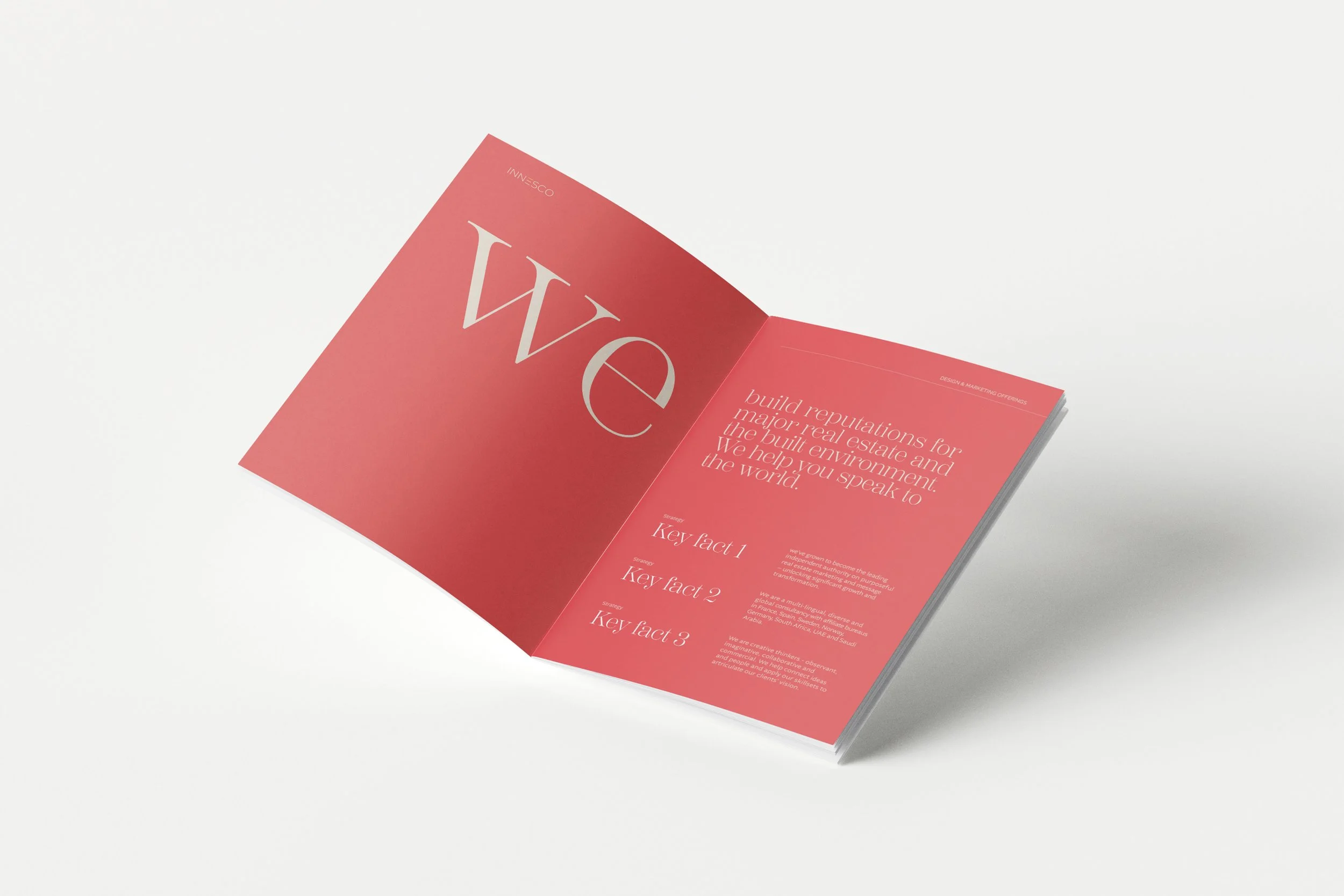
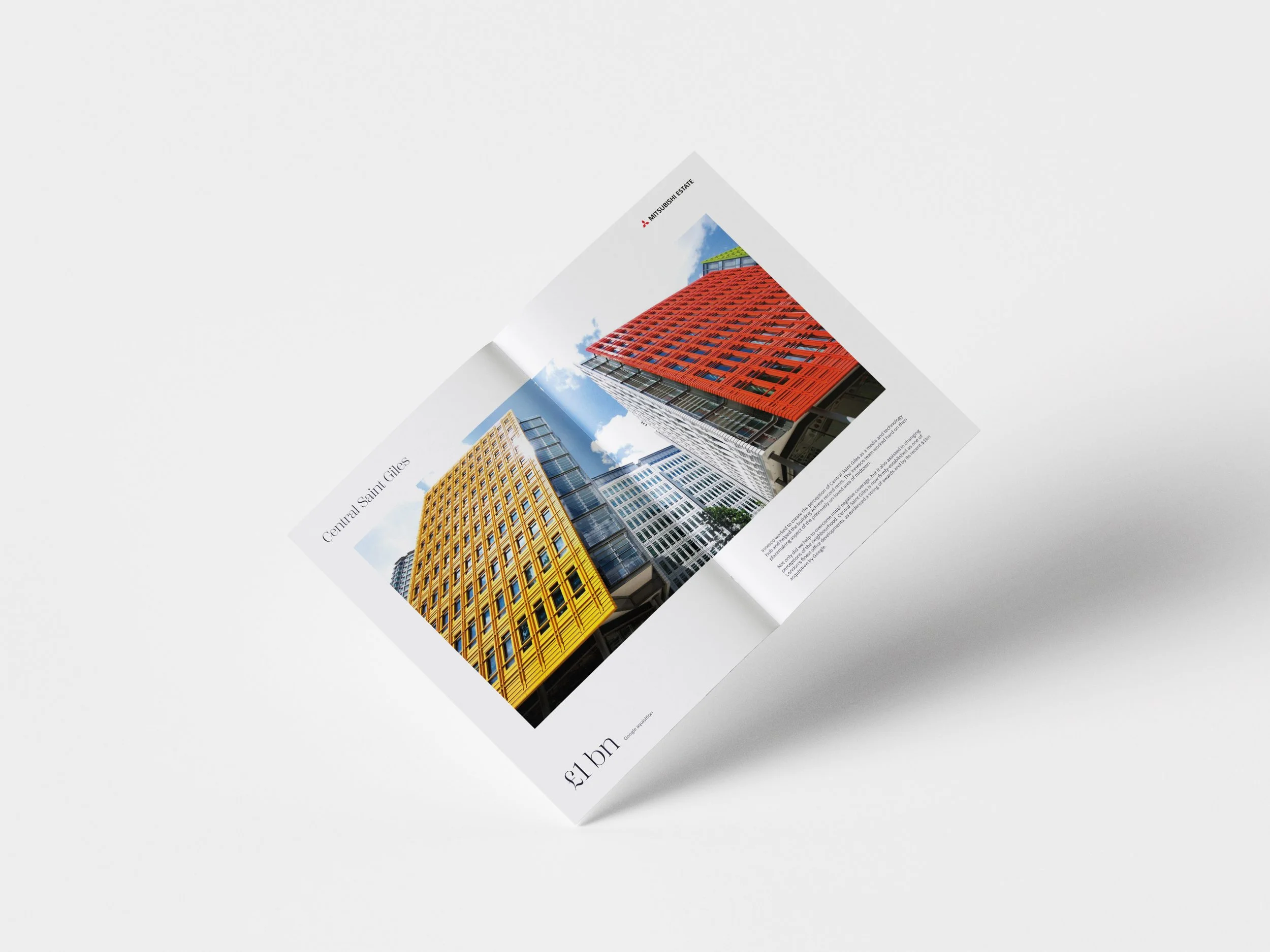
I was tasked with the responsibility of designing a range of catalogues that detail the five unique offerings/services Innesco provides. Our current display of these services takes the form of a simple infographic, with each service having its own colour identity.

Colour
I saw an opportunity to make this presentation more appealing by utilising this colour system to enhance brand reliability across a visually striking collection of individual brochures. By harmonising the colour palette throughout the brochures, I aimed to not only maintain brand consistency but also infuse each one with its own distinctive visual personality. This approach not only improved the aesthetic appeal but also ensured easier navigation and understanding for our clients, ultimately reinforcing our agency's commitment to excellence and innovation in every aspect of our offerings.
Big ol’ type
Choosing big type as a design focus stemmed from a deliberate shift away from our previous illustration-heavy approach. While illustrations have their merits, I recognised the need to streamline our visual communication for greater impact and clarity.
By prioritising big type, I aimed to enhance readability and convey key messages more effectively, ensuring that our audience could quickly grasp the essence of our content. This decision to reduce the emphasis on illustrations wasn't about dismissing their value entirely but rather about striking a better balance between imagery and text. By incorporating illustrations more sparingly, I aimed to maintain visual interest while preventing potential clutter and allowing our typography to take center stage, thus elevating the overall design aesthetic and enhancing the user experience.
Client branding & activation.
I got to go wild and come up with cool stuff for client piches relating brand activations and identity. Having the opportunity to conceptualise experiences from the ground up was something i found extremely exciting. From brainstorming to making it happen, I got to dream up all sorts of fun ideas like interactive installations, pop-up gigs, and digital adventures.
As of now, the below pitches are still being considered. However, if accepted, the end results will be displayed on my website.
Exhibition design ideation

I was charged with devising stand design concepts for a prominent architecture company. With a mandate to craft immersive and distinctive options, the pressure was on to deliver innovative ideas that would set the client apart from competitors. The task demanded a delicate balance of creativity and practicality, requiring thorough research into the company's brand identity, target audience, and industry trends.
Incorporating elements of architectural flair, interactive experiences, and cutting-edge technology, the aim was to conceptualise stands that not only showcased the company's expertise but also provided a memorable and engaging experience for visitors.
I navigated through multiple iterations and feedback loops, ensuring that each concept resonated with the company's vision while pushing the boundaries of convention to create a truly standout presence in the competitive landscape.
Route 1
futuristic & immersive
Route 2
Curated & luxurious
Pitch 1: ’Portals’
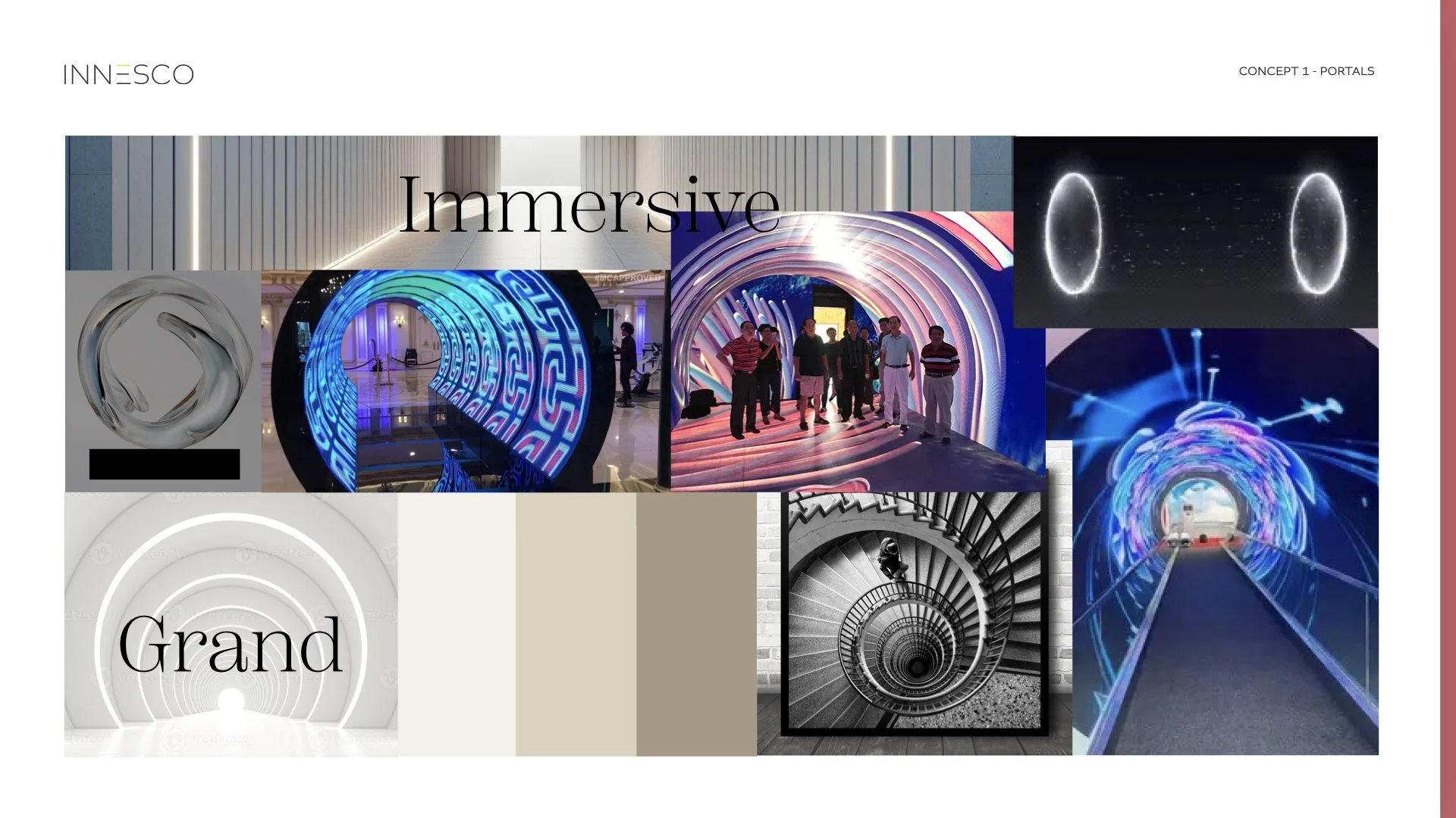
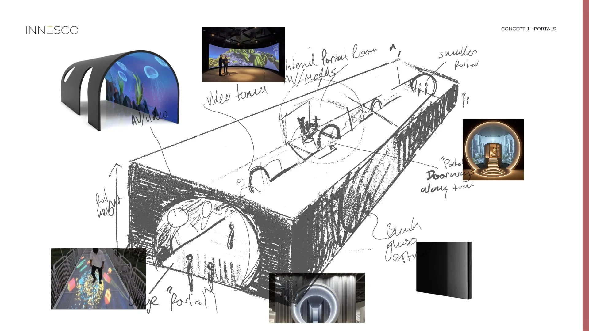
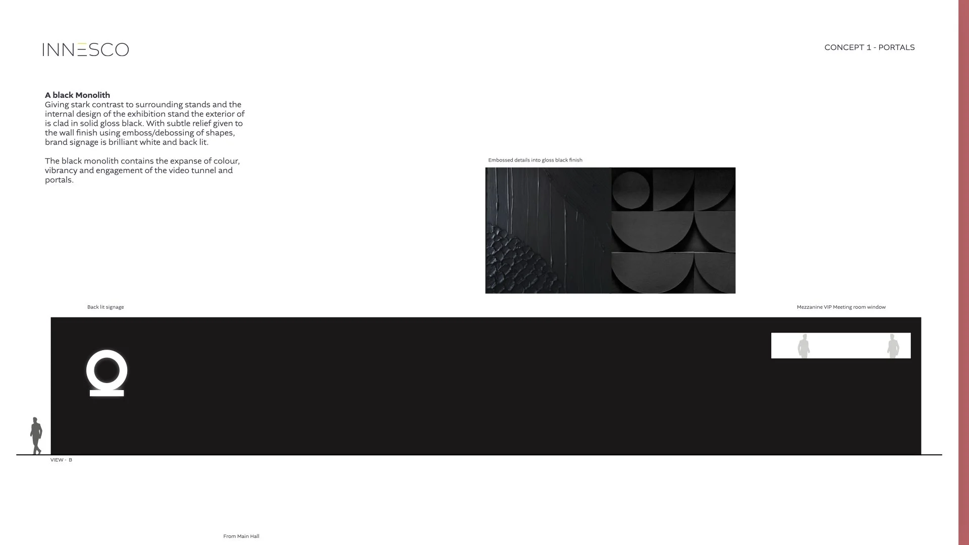
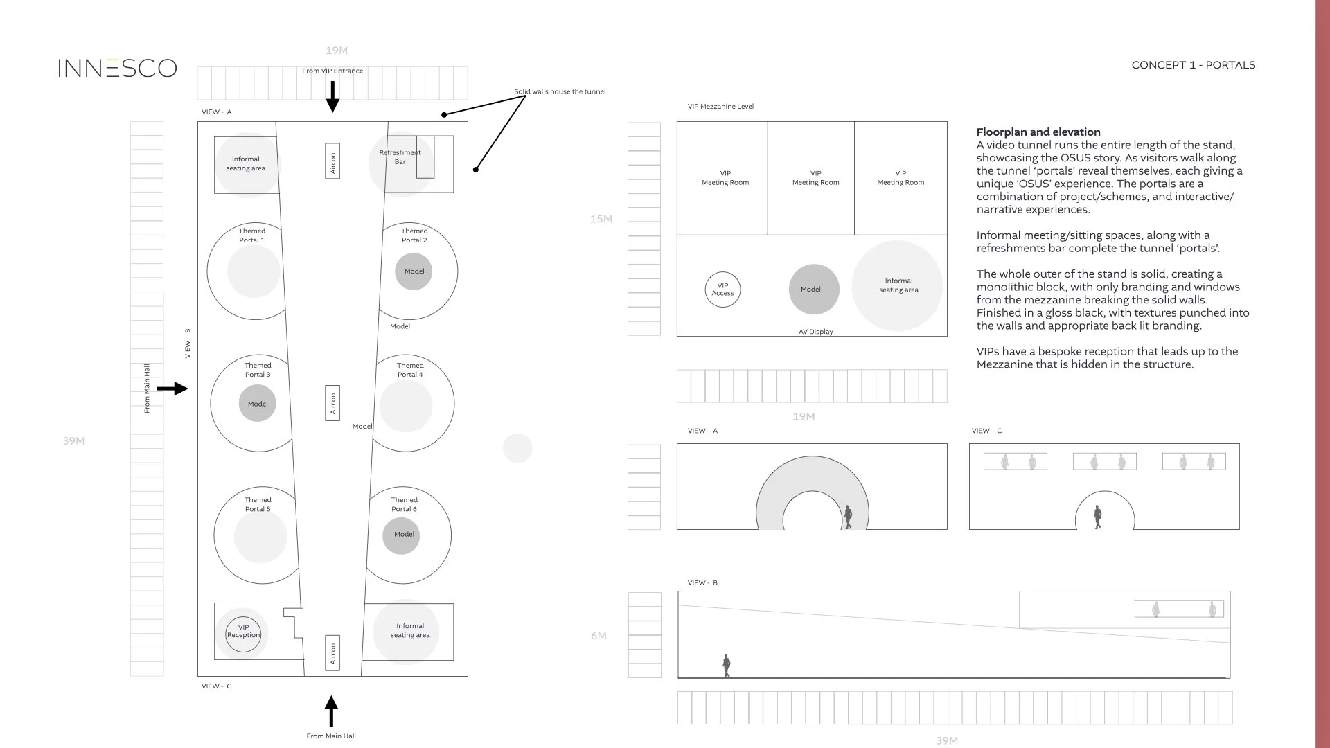


Concept 1 ‘Portals’
An experience that takes our visitors a tour of OSUS developments, through an immersive and attention-grabbing exhibition stand. Incorporating a visually striking and interactive grand vision tunnel visitors can jump into different unique OSUS experiences.
Portal ideation (user journey)
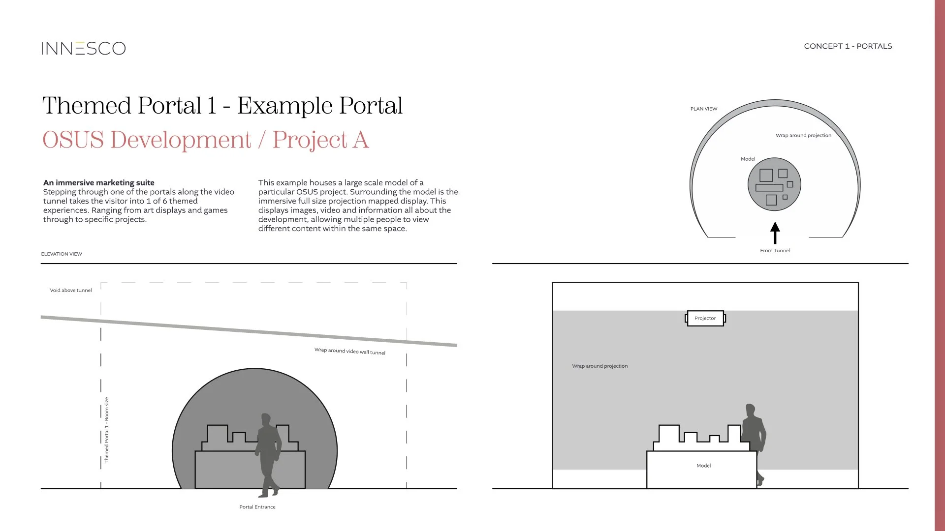
Portal 1 - development showcase (client project A)
Projection mapped room with a central scale model of the project. All visuals displayed are relevant to the project/messaging
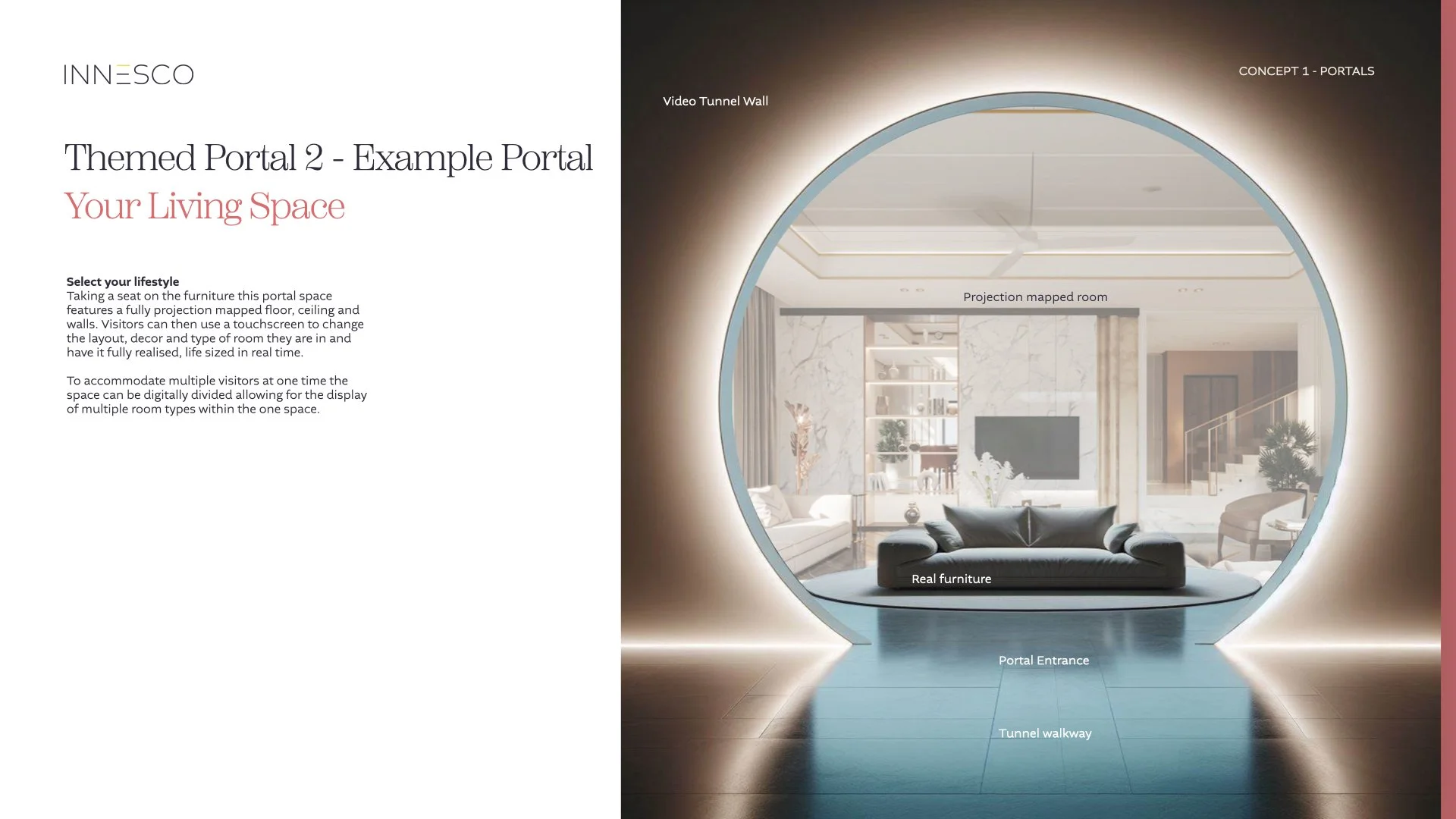
Portal 2 - Your living space
Living space generator
Real furniture within a projection mapped living room
Visitors customise the living space to their liking via an interactive selection too via a touchscreenl.
Users have a taste of what their properties could look and feel like in real time from the comfort of a sofa.
Portal 3 - development showcase (client project B)
Projection mapped room with a central scale model of the project. All visuals displayed are relevant to the project/messaging
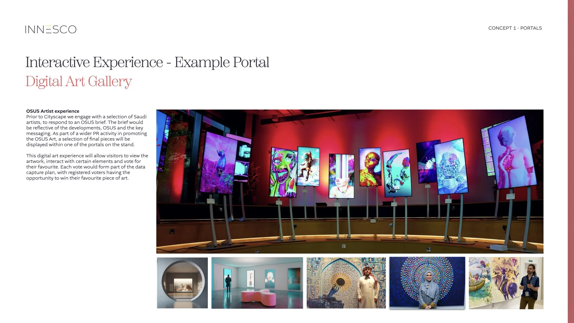
Portal 4 - Community art gallaery
Client artist experience
Following the client engaging with artists (see following pages) local to each development this portal experience features all the selected artworks in a virtual interactive gallery space.
Portal 5 - development showcase (client project C)
Projection mapped room with a central scale model of the project.
All visuals displayed are relevant to the project/messaging
Portal 6 - Build interaction
Interactive experience
Interactive floor with pressure sensitivity - visitors jump to ‘build’ an OSUS development. Projected onto the surrounding walls a select OSUS development builds and completes in time with the users actions.
Using A.I renders to quickly visualise concepts
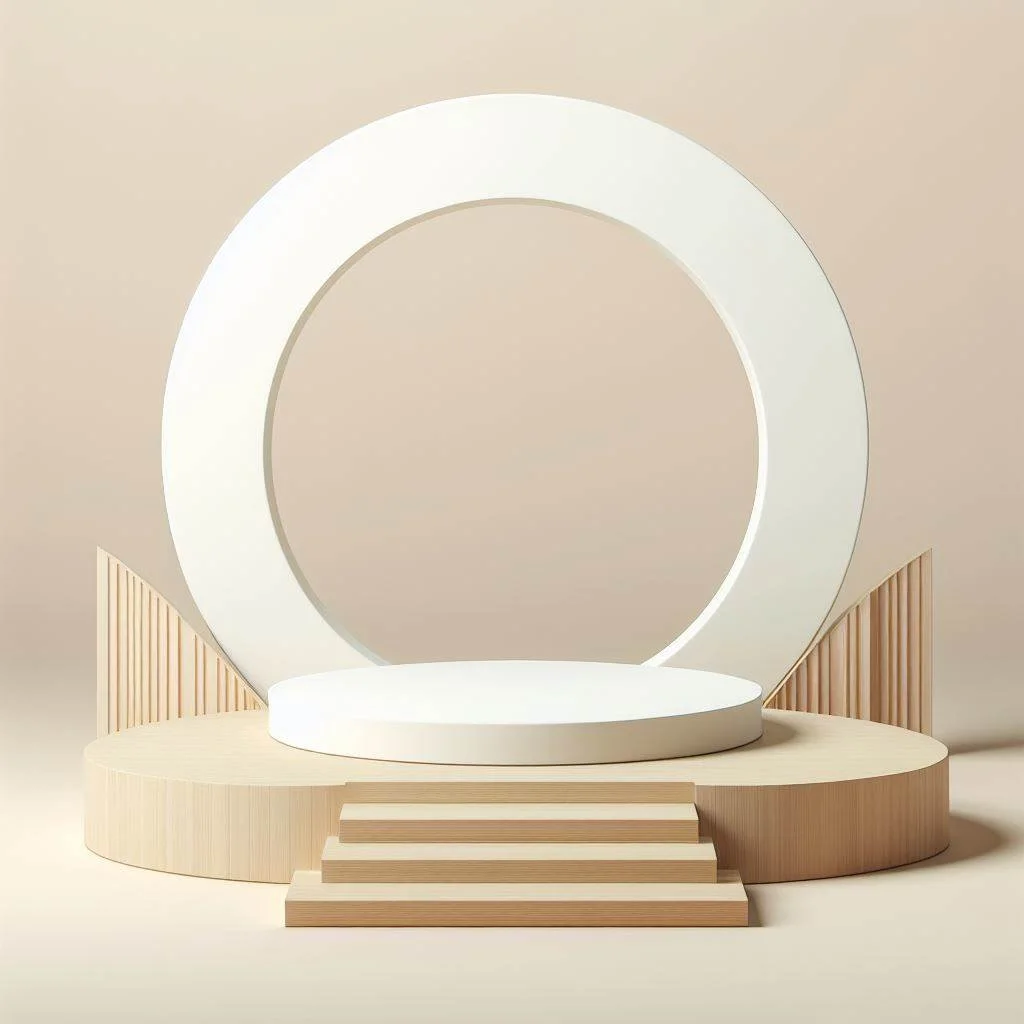
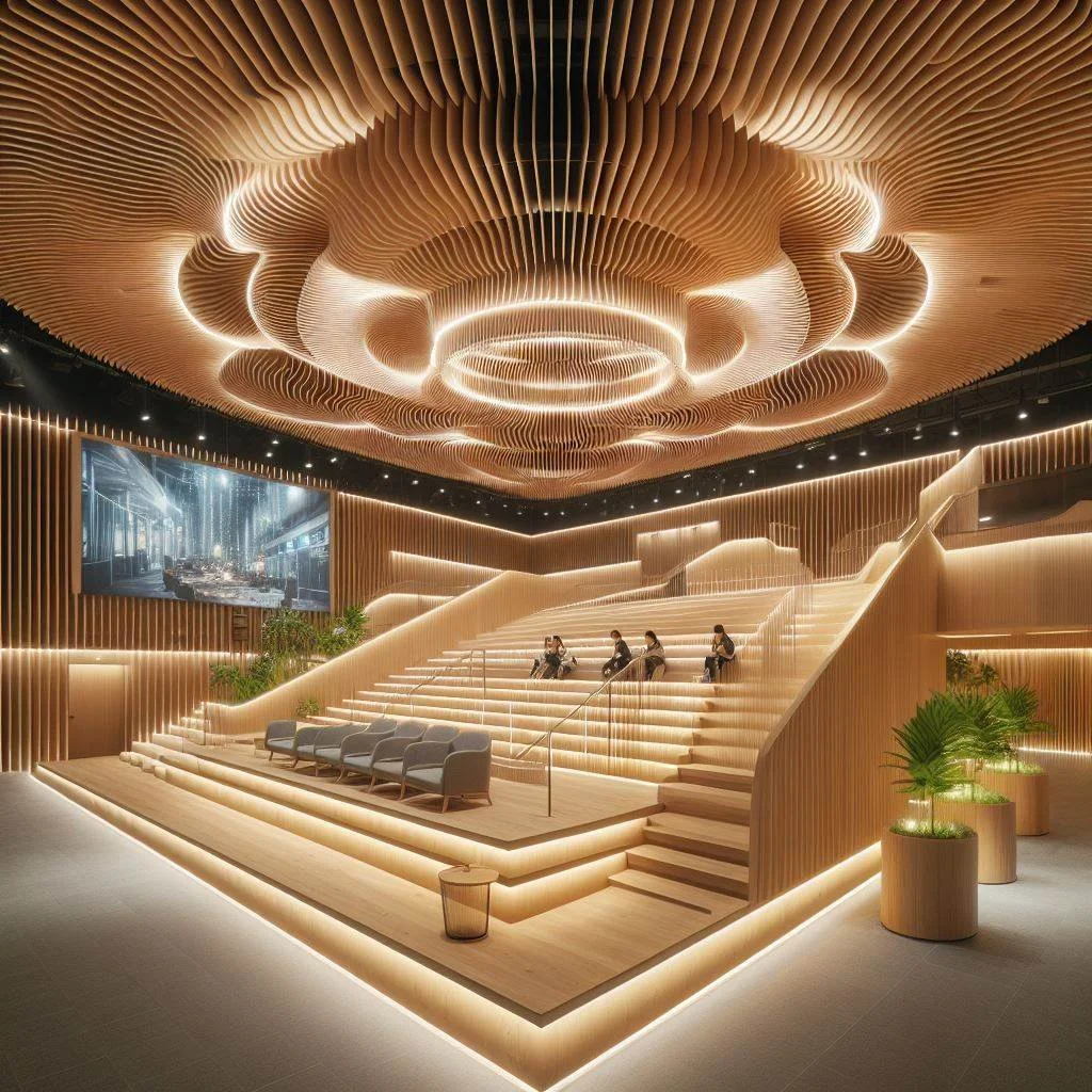
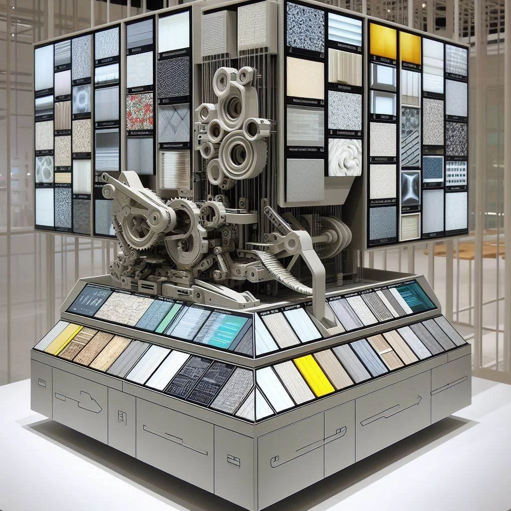

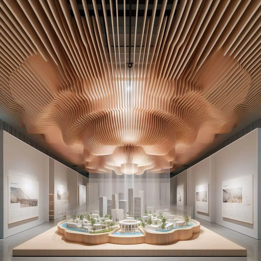
Pitch 2: ’Dissasemled’
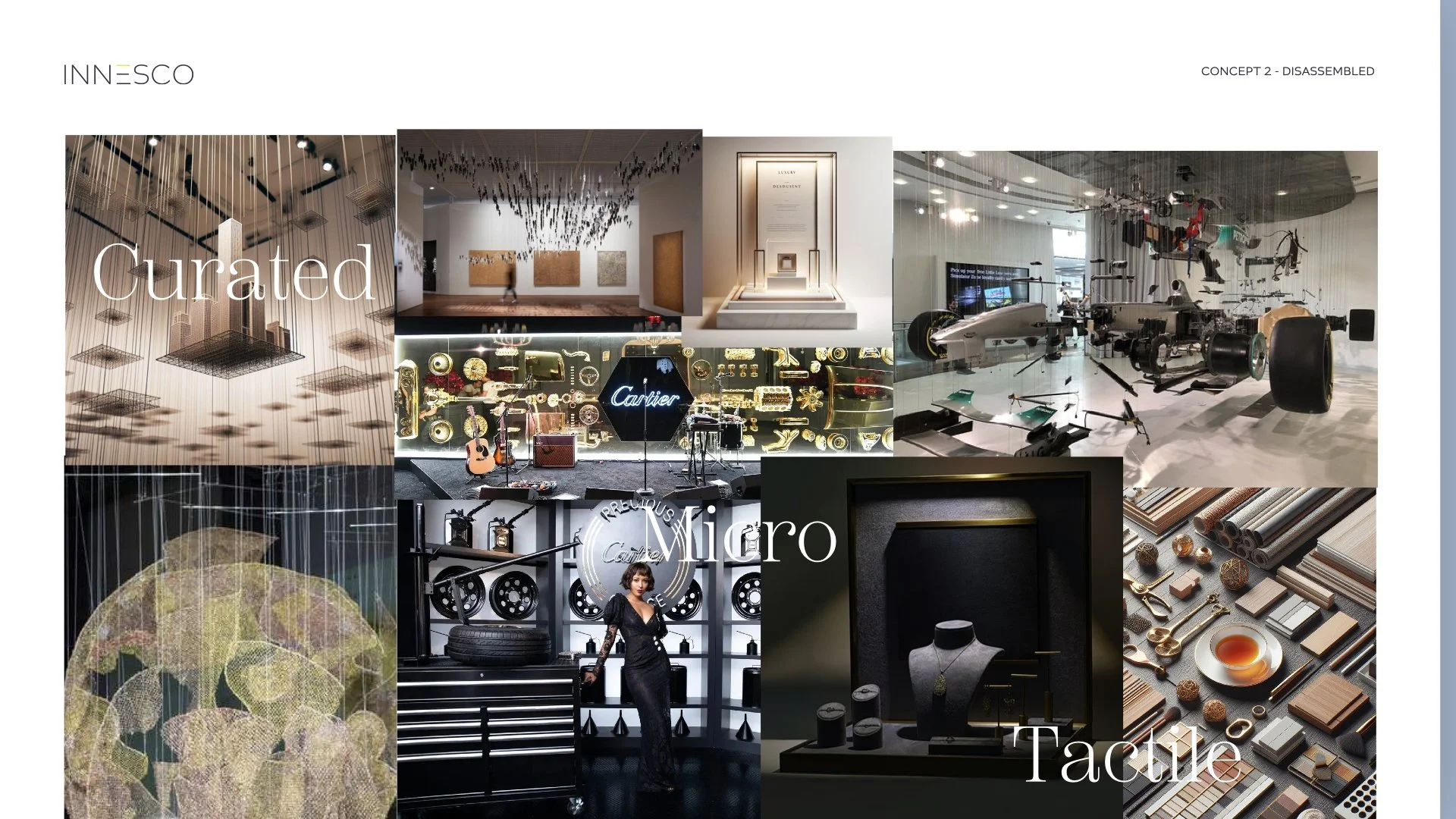
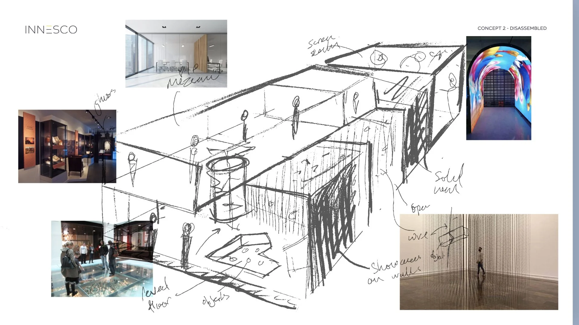

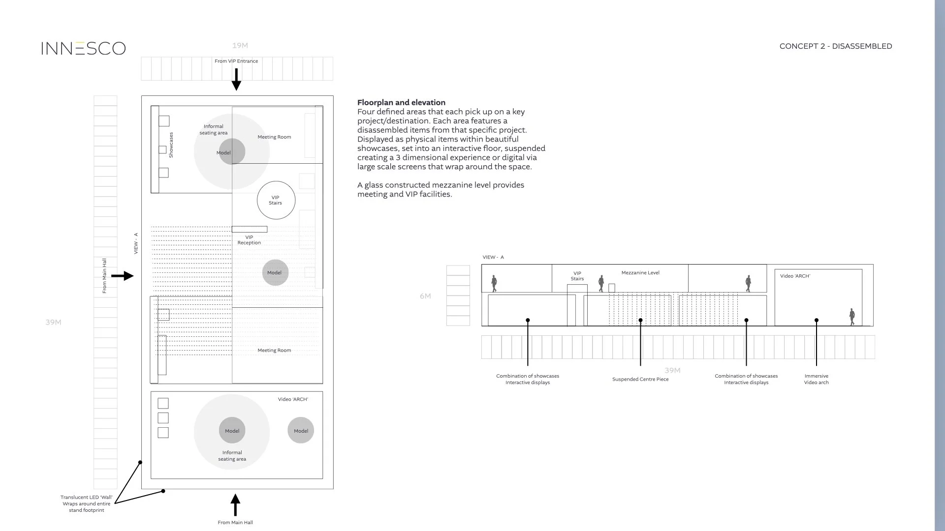
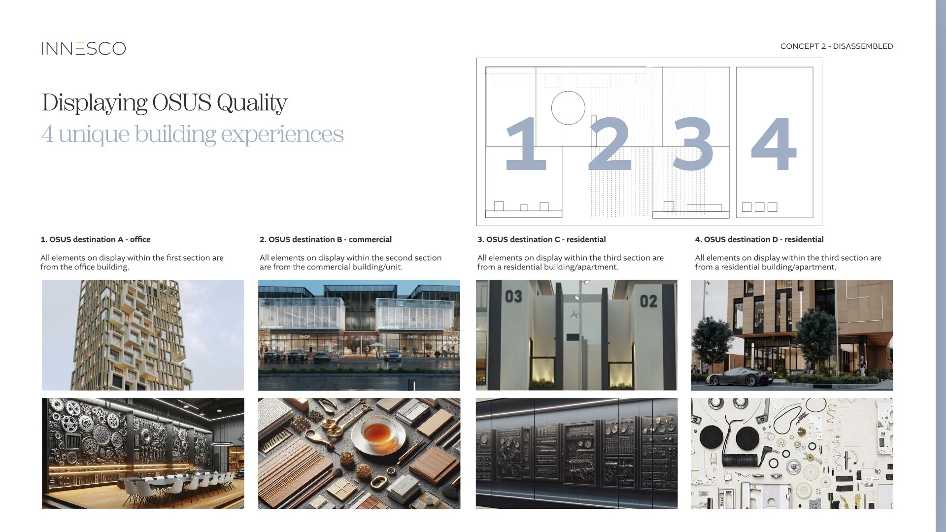
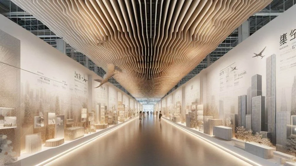
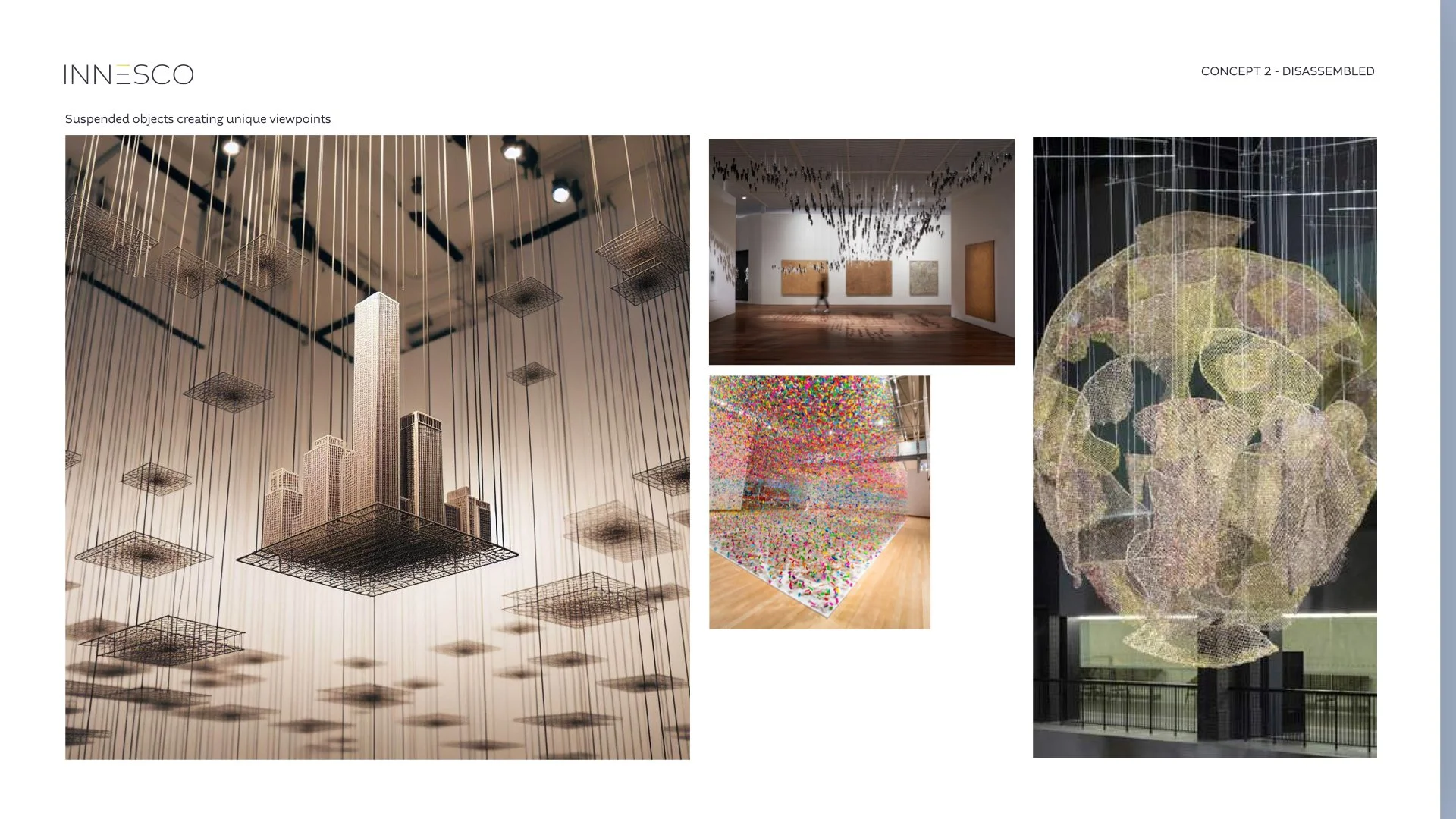
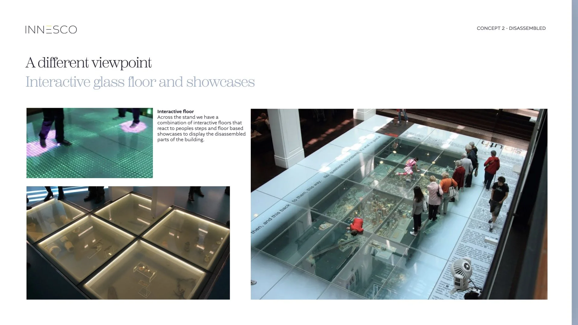
Concept 2 ‘Disassembled’
A luxury gallery experience that pays respect to the most minute/micro materials that form part of an OSUS development. This museum style experience takes an OSUS property and displays each individual element that goes into making an OSUS property. Highlighting the quality materials, details, and design expertise that create an OSUS property.
User journey
Sector 1 (client project A - Office)
Deconstructed materials taken from a luxury high rise building. The focus would be on the high quality stone and metals used. The display would be showcased within a glass panelled wall.
Sector 2 (client project B - Residential)
Deconstructed materials taken from a luxury high rise building. The focus would be on the high quality micro materials used; such as high strength metallic bolts and luxurious wood finishes. The display would be showcased within a large glass panelled table. Here is where marketing meetings would occur.
Sector 3 (client project - Commercial )
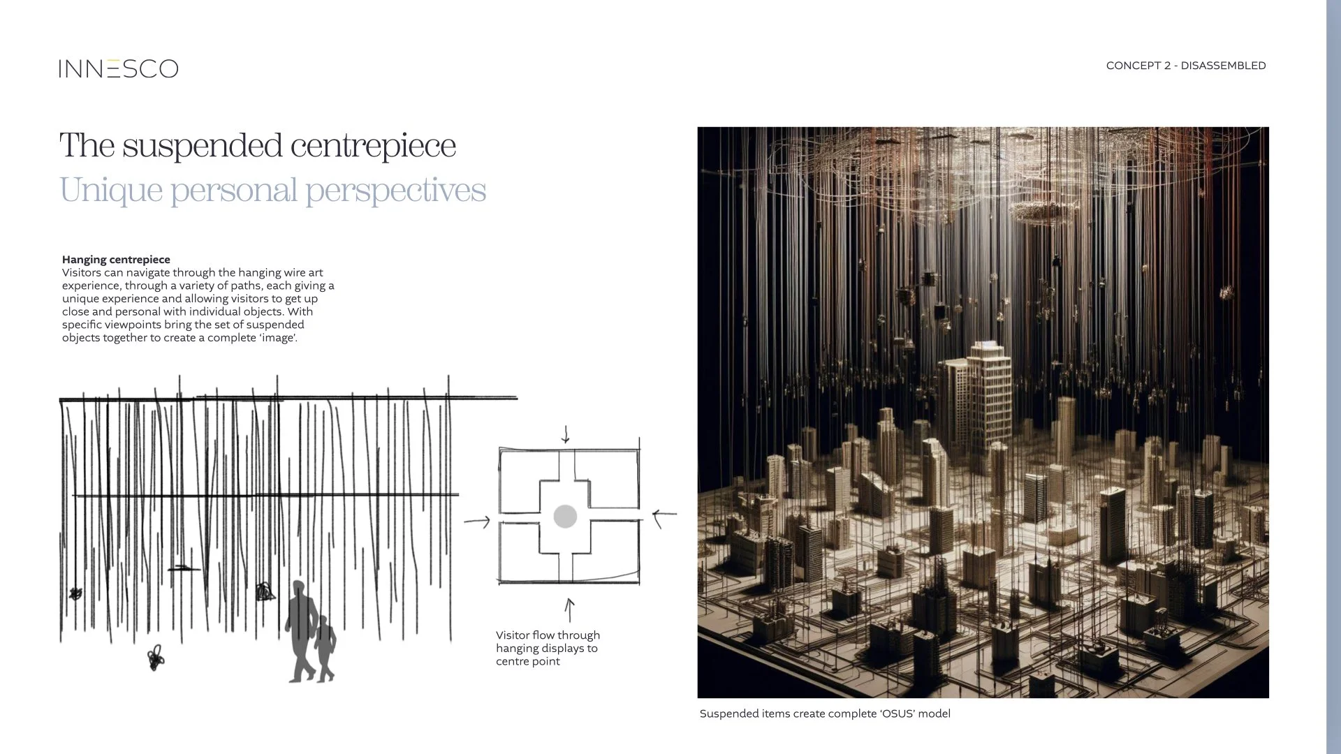
Building on the deconstructed elements mentioned earlier, this section will transition into a central immersion hub where materials will hang suspended from wires. A multi-entrance walkway will guide visitors through the suspended wires, leading them into a central area featuring a scale model of a development plot.
Branded animation
Bringing life to the static company logo.
Thematic outros
Incorporating the above logo with a dynamic outro the blends live footage with animation illustration.
Branded podcast
animated intro that reflects the forever changing landscape of architecture across the built environment.
illustrative movement
Working with animators to bring our more complex illustrations to life.
Editorial brochure
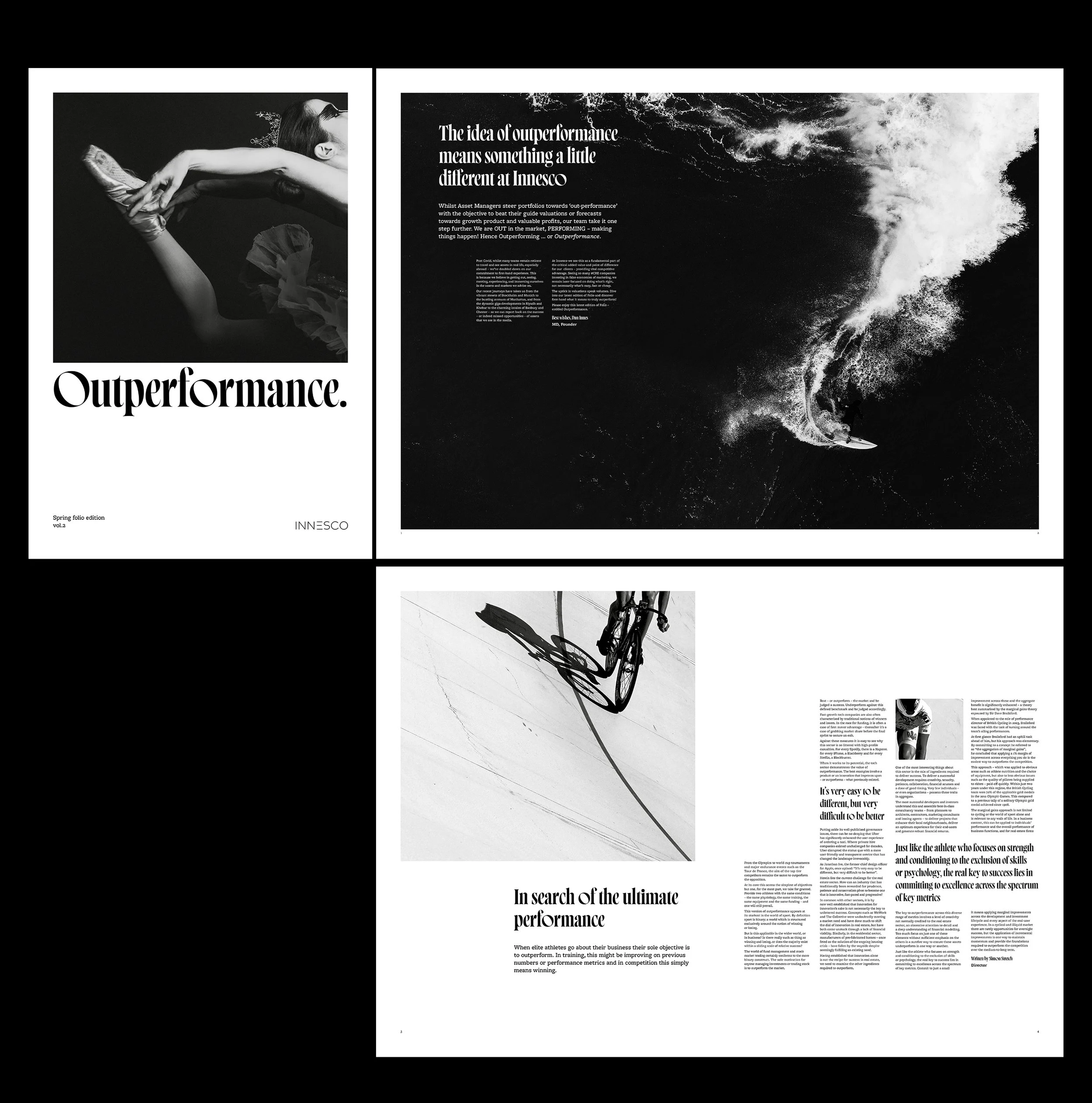
Leading the design of the spring edition presented an opportunity to encapsulate the latest developments and achievements within the firm, as well as noteworthy projects and collaborations with clients.
Theme 1
Minimalist monochrome
Translating to socials
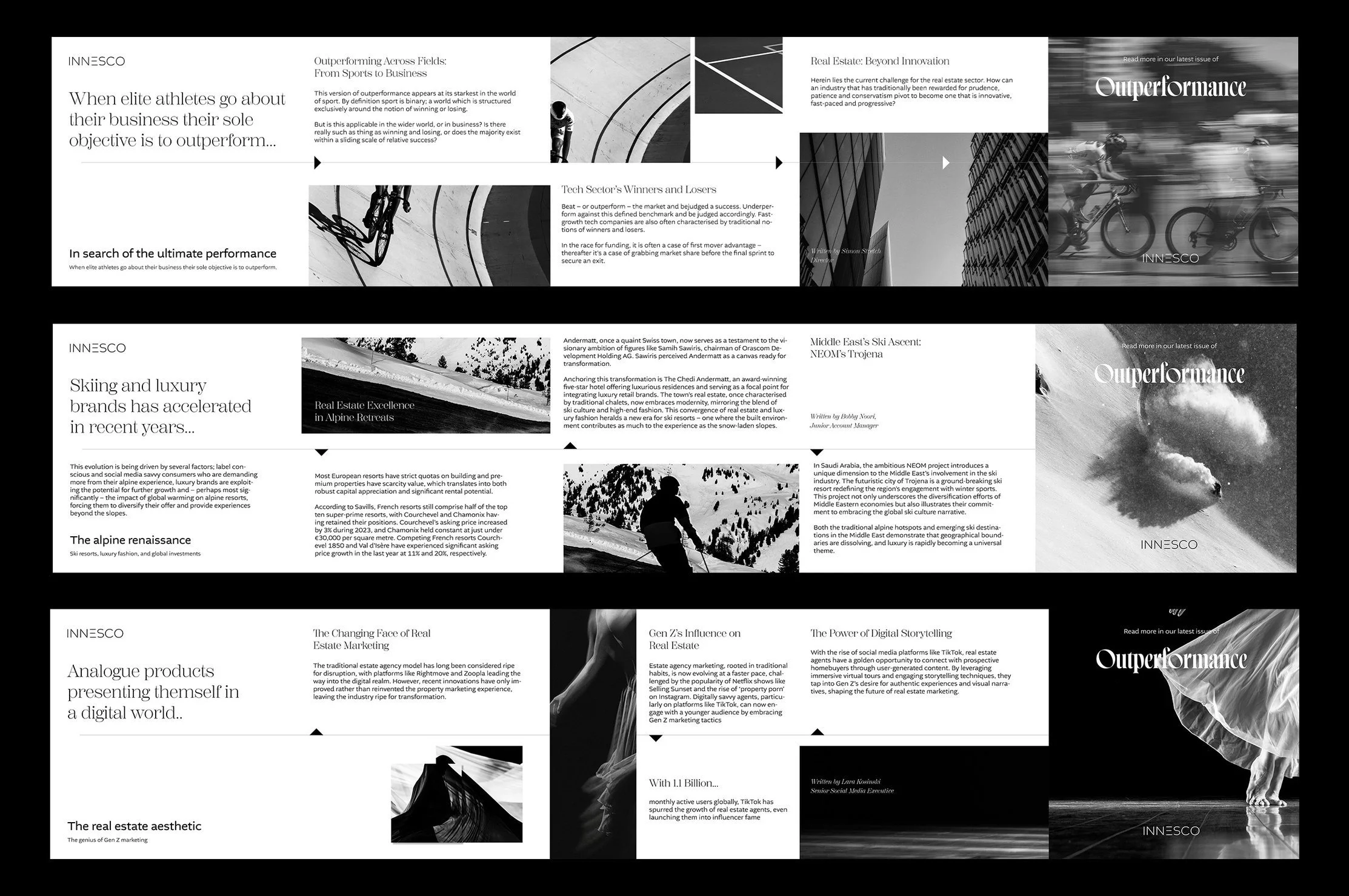
Transforming this publication into social media posts and other marketing collateral allowed for wider dissemination of these stories, amplifying the company's reach and impact. By seamlessly translating the content across various platforms, from print to digital, the firm effectively leverages its internal resources to strengthen its brand presence and foster deeper connections with both employees and external stakeholders.
360 Campaign.
To create the "Speak to the World" campaign, I integrated print, brochures, digital, marketing, and social media elements. The campaign, aptly named to convey its message of global communication, adhered to the vibrant and coloured branding of Innesco
In the digital realm, website content and email campaigns were optimised for maximum engagement, leveraging compelling visuals and persuasive messaging. Social media platforms served as dynamic channels for storytelling and interaction, where content was tailored to suit each platform's unique characteristics and audience preferences..
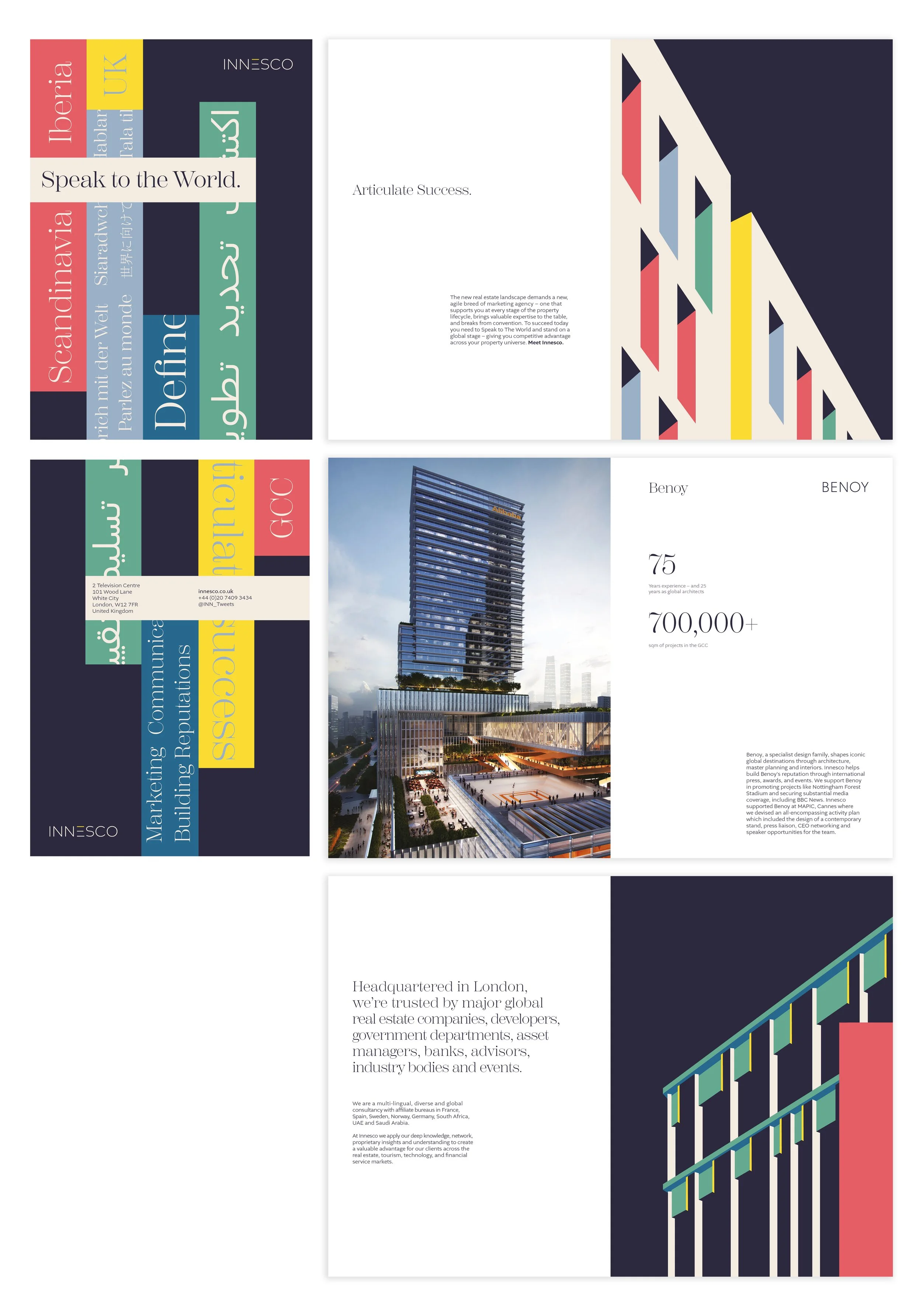
Each component of the campaign was meticulously designed to resonate with the target audience and amplify the brand's identity. Print materials such brochures and coasters were crafted to grab attention and spark curiosity, while brochures provided detailed information about the campaign's objectives and offerings.
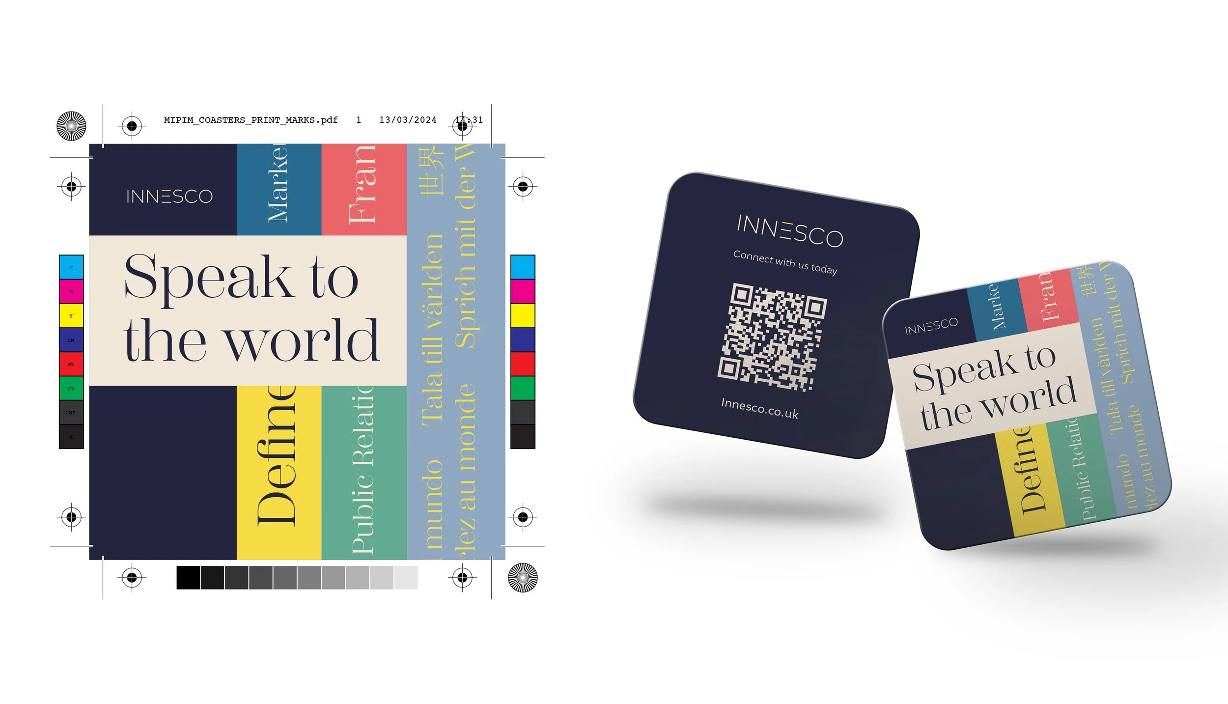
By maintaining consistency across all touchpoints and embracing the colorful branding of Innesco, the "Speak to the World" campaign effectively conveyed its message and fostered meaningful connections with its audience.

