PERSONALPROJECT.
I undertook a self-initiated website redesign project for Resident Advisor, applying my web design skills and creativity. Analyzing the current site's user experience, I identified areas for improvement and crafted a fresh, modern layout. The redesign focused on enhancing navigation, optimising mobile responsiveness, and prioritising essential content

Posters and collateral for a limited run of my colleague’s one-man play, Artem.
RESIDENT ADVISOR
UI DESIGN.
A clean and modern e-commerce site for local fashion label Marta. Optimized for mobile devices and selling on Instagram. Clothing by Lauren Winter and Ulihu.
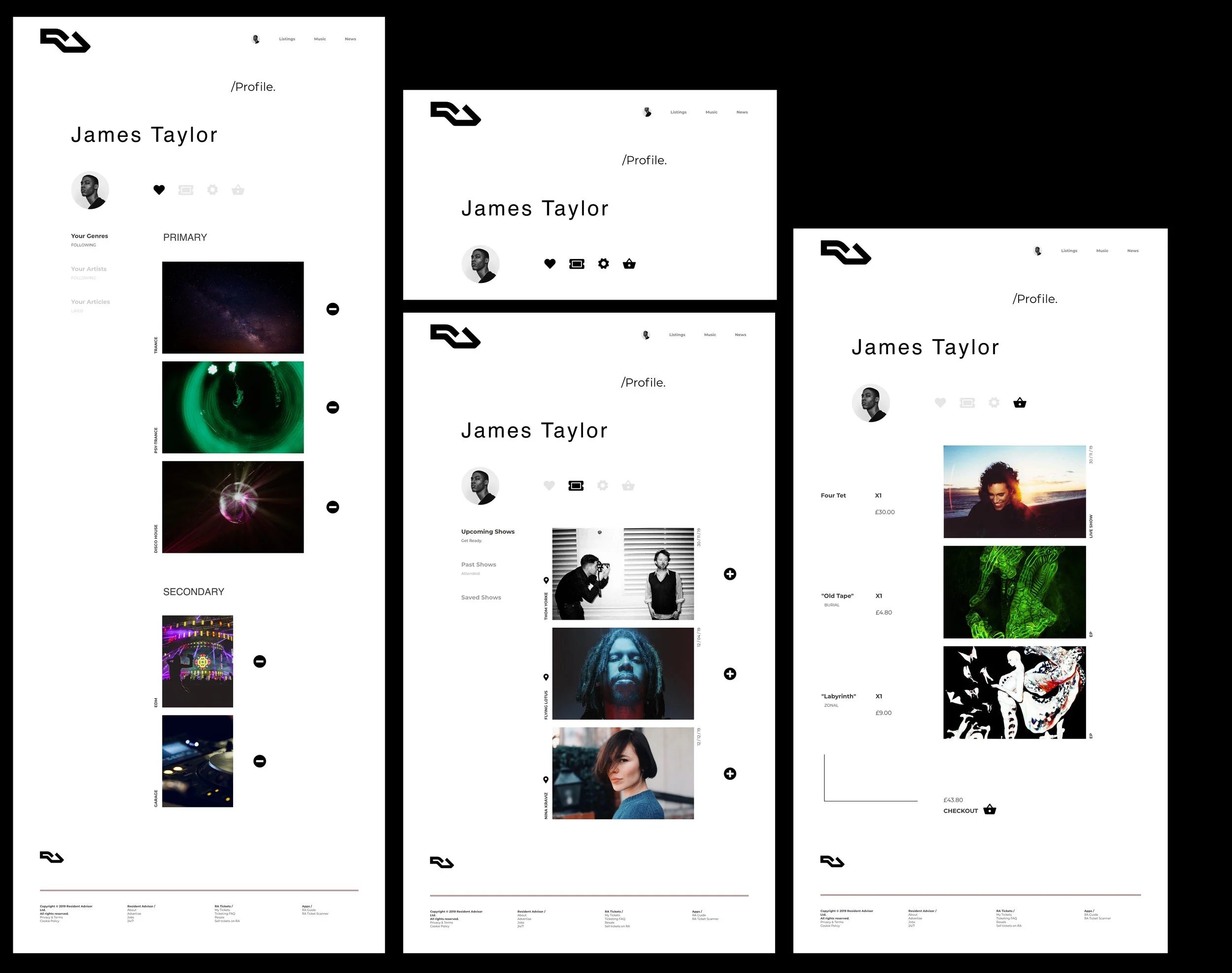
PROFILE PAGE REIMAGINED
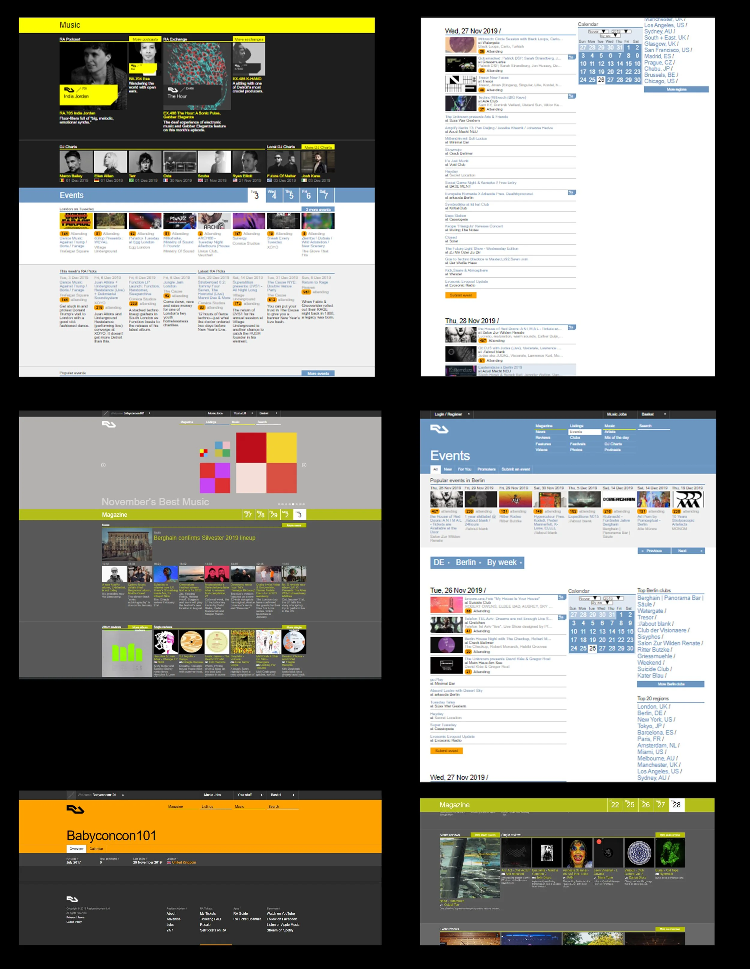
The old website was cluttered and resembled a forum message board due to its disorganized layout and overwhelming amount of content. The design lacked a clear hierarchy, making it difficult for users to find essential information or navigate through the site efficiently.
CLUTTER - ENOUGH OF IT!

To ensure album covers pop more in my UI design, I focused on creating a minimalist and sleek layout. By using a neutral background and strategic negative space, I allowed the album covers to take centre stage and command attention. Additionally, I incorporated subtle visual effects, like shadows or gradients, to add depth and dimension to the covers. My aim was to provide a visually harmonious and uncluttered environment, elevating the impact of the album artwork and allowing it to shine brightly.
ARTWORK THAT POPS

my goal was to create a clean, organised, and user-friendly interface. I began by conducting a thorough analysis of the existing design, identifying elements that caused clutter and confusion.